Developing a brand and digital destination that inspires wine moments.
Services
Naming
Logo and Visual Design
Brand Style Guide
Social Media Branding
Team
Strategic PR Agency
Content Writer
Role
Brand Designer
Client
Arterra

A digital destination for wine lovers
The challenge was to unite over 10 disparate social media accounts into one cohesive, dynamic, and utterly inspiring platform.
Enter Qu’est-ce qu’on boit?—literally, “What are we drinking?”—a question that Quebecers ask themselves on the regular. This platform doesn’t just answer that question; it redefines the conversation, blending entertainment with the rich culture of wine in Quebec. More than just a wine hub, it’s a fresh, vibrant lens on how wine mingles with the everyday lives of Quebecois.

Clink! The birth of a logo with personality
The logo? It’s all about that clink—the distinct sound when two wine glasses meet in a toast to kick off those celebratory moments. I captured that exact feeling in the logo, when the splash of wine almost jumps out of the glasses, giving the design a life of its own. And the best part? This logo isn’t static. It’s versatile enough to change its backdrop, colors, and even the sleeves of the people clinking glasses, making it the perfect fit for any occasion.

Chaos to cohesion
The design journey began with a deep dive into the existing accounts, auditing and reshaping them into a new parent account that still honors the essence of each brand. I didn’t just want to elevate wine moments; I wanted to infuse them with fun, bold graphic elements that highlight the content and products in a way that feels fresh and exciting.
The introduction of vibrant colors as the primary palette brought the energy, while a carefully selected neutral palette kept everything in harmony, ensuring that individual brands could shine without clashing with the overarching QQOB aesthetic.

The art of visual consistency
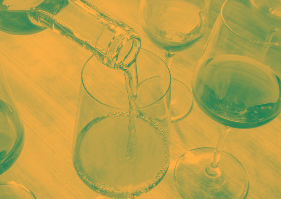
Imagery was key, and to keep everything consistent with the brand’s visual identity, we introduced a duotone filter across photography. This not only aligned with the brand colors but also offered versatility, giving the team access to a broader range of images while maintaining a cohesive look.

Where fun meets flawless design
As a result, social media deliverables pop with fun, graphic elements, animations, collage touches, and a visual identity that’s as distinct as it is consistent.


