Fintech
Mobile-first web app
Pennyworks: from a name to 200+ shipped screens in six months
Problem
Pennyworks had a name and an idea, but no brand, design or product.
Solution
Brand, design system and product screens built in parallel, so every screen came from shared components.
Impact
200+
screens shipped in six months, against a 10 to 18 month norm for the category
My role
Design director. Branding, UX/UI and the marketing site. Team: a UX designer, a UI designer and a developer.
Context
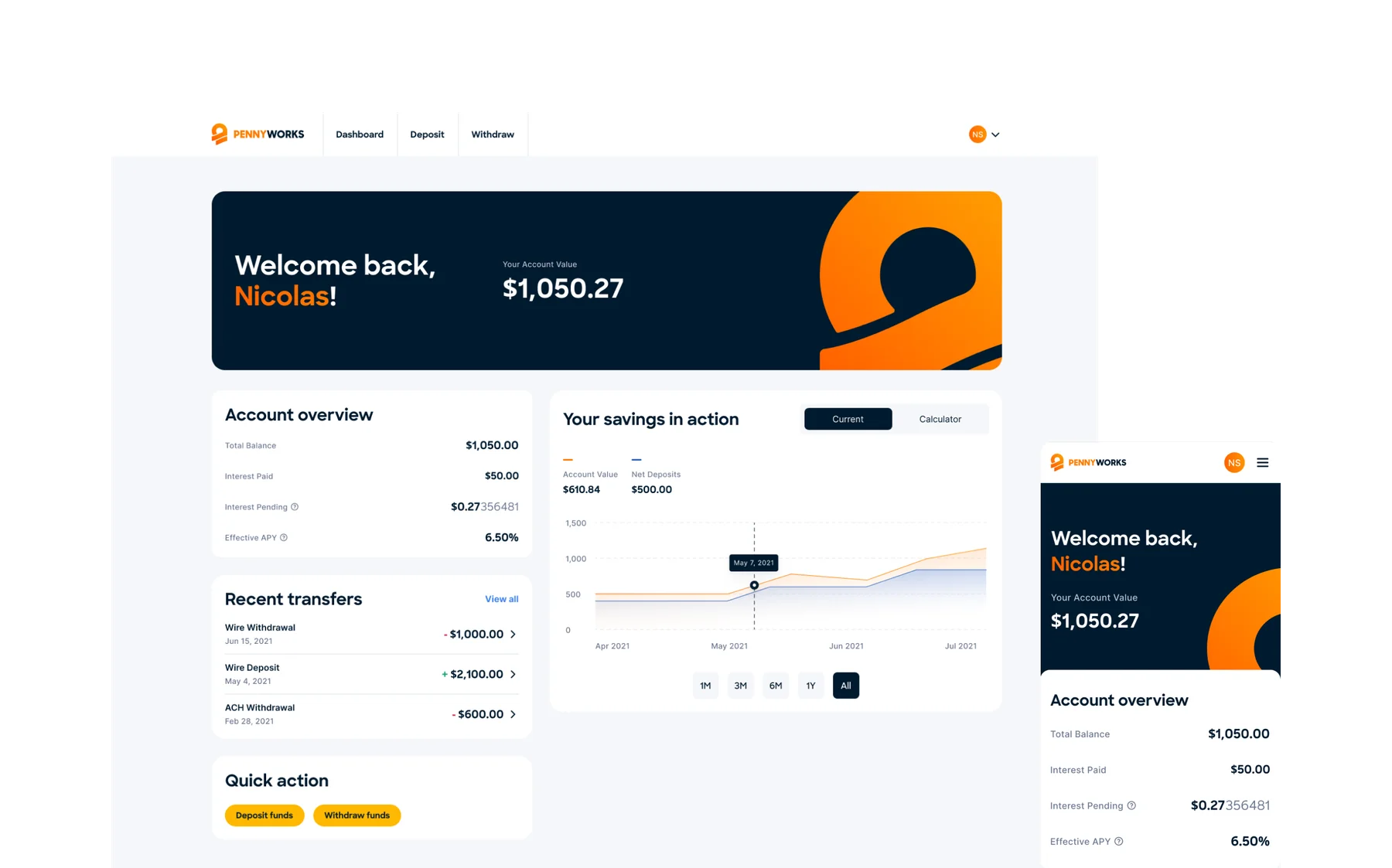
Pennyworks is a high-yield savings platform powered by decentralized finance products. Fintech products have to earn trust before anyone hands over money, so the brand and the interface had to feel credible from the first release.
- A crowded financial savings market
- An accelerated timeline, with internal and external stakeholders
- Inconsistencies with API integrations
Key decisions
1. Build the design system with the first screens, not after
Components and tokens were defined as the first flows were designed, so the 200th screen used the same parts as the first.
2. Settle the app structure in wireframes
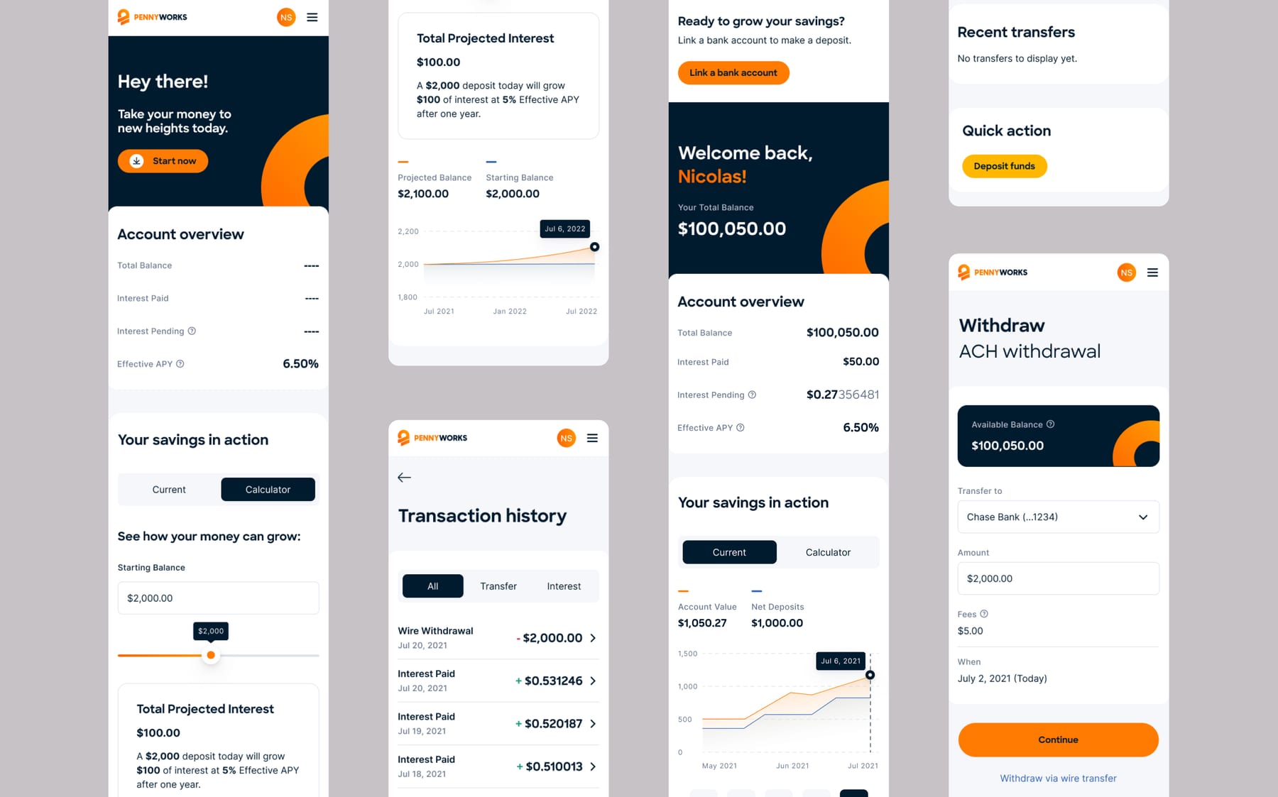
Competitor analysis and user, business and technical requirements fed more than 100 wireframes before the UI was applied.
3. Stand out where the category plays it safe
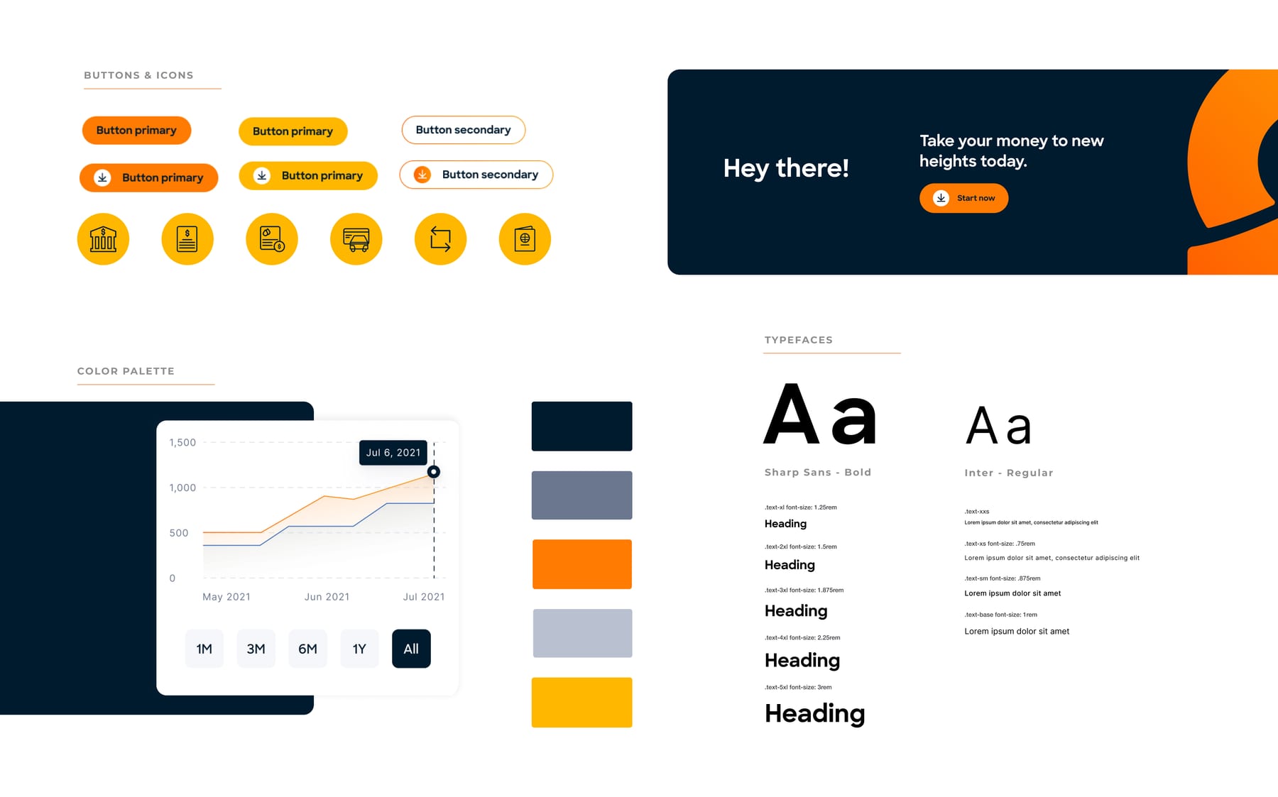
Competitors stayed in blues and grays, so I chose persimmon orange for optimism and energy. A sun-inspired logo adds warmth without looking corporate.
4. Give the brand a structure to build on
I distilled early ideas into pillars, values and a tone of voice, so the brand could scale across the app and the marketing site.
Results
- 200+
- Screens shipped
- 6 months
- From name to product, against a 10 to 18 month norm
- $2M
- Pre-seed funding
What I would do next
I'd run usability tests with less tech-savvy users on deposit, multi-factor authentication and proof of address, and compare the needs of tech-savvy users with everyday savers. I'd also research attitudes toward crypto as they stand today.