B2B commerce
Headless e-commerce
2025
B2B Supply Commerce: turning a browsing storefront into an ordering tool for repeat buyers
Client name withheld under NDA. Screens are anonymized.
Problem
Repeat buyers abandoned orders partway through, not over price, but because they weren't sure they'd picked the right items.
Solution
A headless Shopify storefront built around how administrators already reorder: best sellers first, an Express Flow table, a refill grid that mirrors the physical tray, and a shorter registration.
Impact
15%
sales up since launch, shipped in 3 months
My role
Sr. UX/UI Designer. IA, UX, UI and design QA.
Context
A B2B specialty supply company sells to practices whose operations staff place the orders. Most are repeat customers who order on a schedule and know exactly what they need. For them the site isn't a storefront. It's a tool they use to do their job.
- Three months from design to launch
- Shopify out of the box isn't built for fast, repeatable ordering, so the front end went headless
- Messy product data, so part of the job was finding the smallest set worth migrating
- Existing photography and assets only
- A new tech director joined mid-project, and much of the business logic sat with people still getting up to speed
Users and their work
Practice administrators keep the supply room stocked. They already kept informal order sheets, and their teams refill from a physical tray with labelled positions. The goal was to design around those habits rather than replace them.
We started from the catalog, order patterns and best sellers, then built rough versions of the key flows and tried to break them. With three months, that told us more, faster, than a research phase would have.
Key decisions
1. Give repeat buyers their own lane
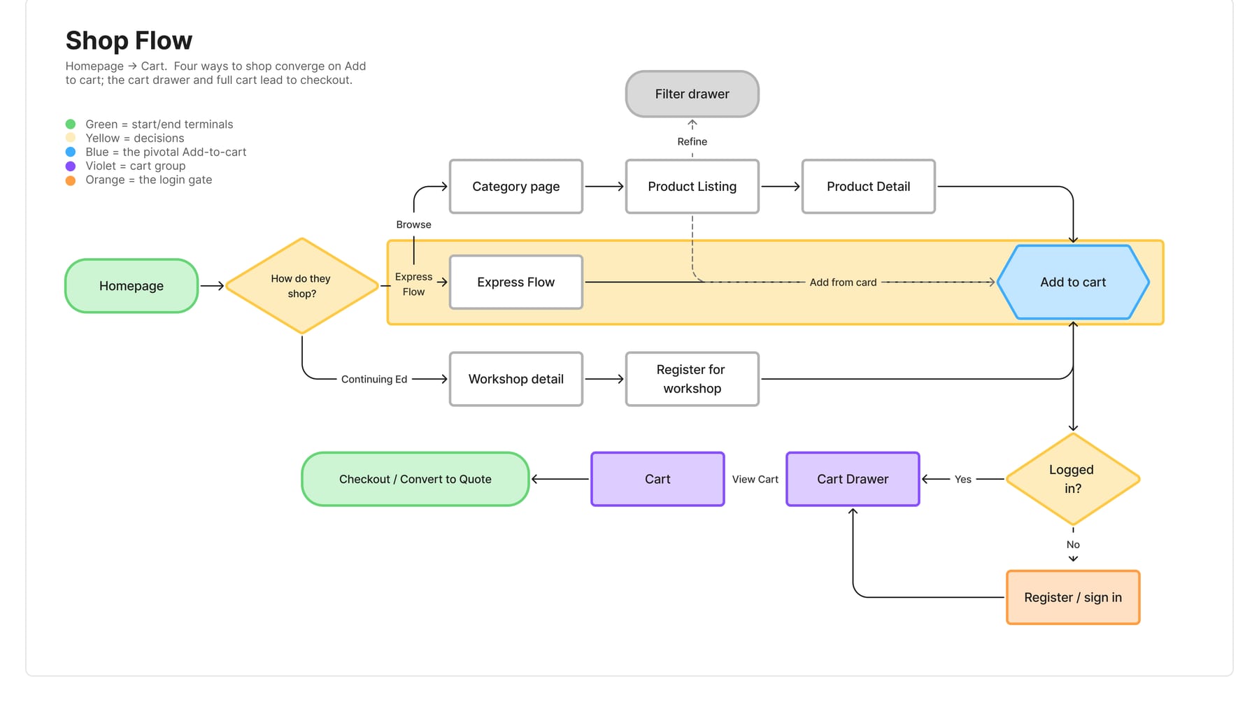
There are four routes to purchase. Express Flow runs alongside browsing, not through it, and joins the others only at Add to Cart.
2. Put best sellers first
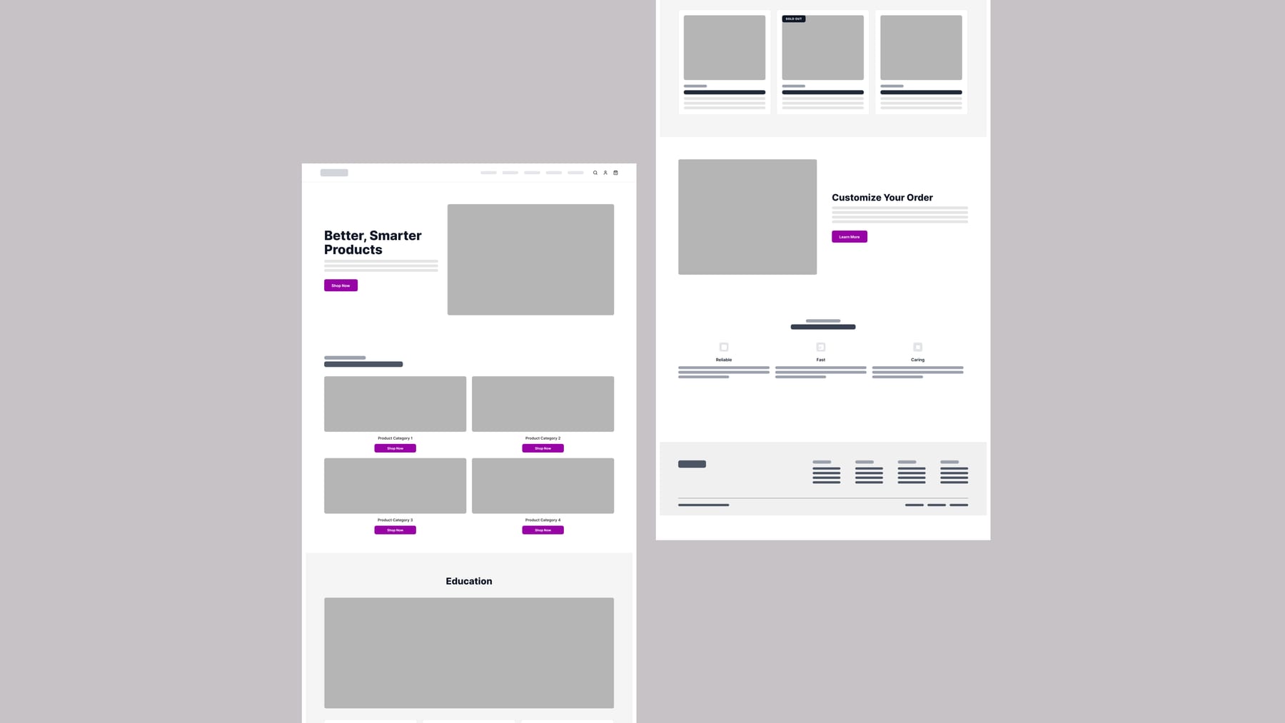
The old homepage gave products, education and brand equal weight, and the category page showed fourteen identical tiles with fourteen identical buttons. The new homepage leads with the hero product, then a weighted best-sellers grid, then an Express Flow band with a three-step summary.
Before
After
3. A table, not a gallery
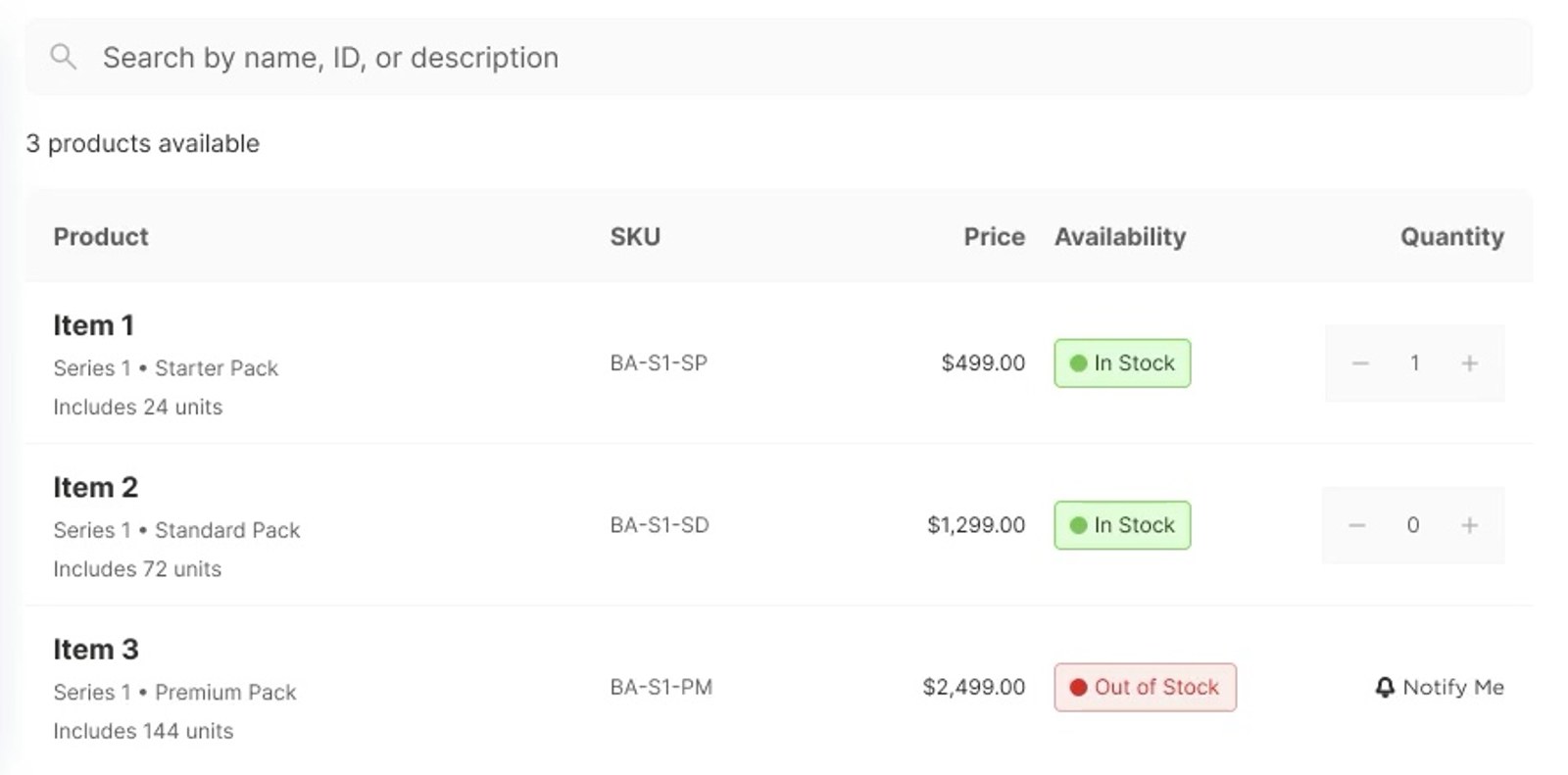
Express Flow lets buyers search by name, ID or description, filter on the left and see results as rows with quantity steppers. Availability shows as a labelled status, and out-of-stock items offer Notify Me, so buyers don't have to come back to check.
4. Match the tray
The old site made administrators translate tray positions into SKUs in their heads, which is where wrong orders came from. The refill screen now uses the same grid and labels as the physical tray, with quantities entered in place and totals that update as you go.
5. Defer what checkout doesn't need
Registration asked for twelve fields before anyone had ordered anything. It now collects only what checkout requires and moves the rest to the account area.
6. Hide the seams
Checkout still ran on Shopify, so control passed between our front end and Shopify at several points. Each handoff was a place to lose confidence, so reducing them was a design priority, not just a technical one.
7. Test wireframes before polish
The client wanted to move straight to polished visuals. I pushed to test wireframes first, so we could check that Express Flow and the refill grid worked the way administrators expected before spending time on visual finish. It felt slower at the time and saved time overall.
Results
- 15%
- Sales up since launch
- 3 months
- Kickoff to launch
The original problem was orders abandoned because buyers weren't confident they had the right items. A sustained sales lift is a reasonable sign that more of those orders now get through. After launch we kept reviewing the metrics set at the start. That review also showed that some existing discounts weren't clearly driving revenue, a business question the redesign surfaced but couldn't solve.
What I would do next
I'd test wireframes across more of the site, not only the highest-priority flows. That decision held up wherever we made it. I'd also bring data and business logic into the conversation earlier: much of what looked like a design problem was a data problem underneath.