Industrial manufacturing
Catalog platform
Technical Catalog Platform: one catalog built on consistent product data
Client name and product imagery withheld under NDA. Screens shown are redacted or recreated to illustrate structure.
Problem
Product specs shared no common fields, and the way buyers searched didn't match how the business organized its product lines.
Solution
Attributes standardized onto one template, a two-branch sitemap, visible navigation and inline live search.
Impact
The site is live. It's too early for before and after numbers.
My role
Lead UX/UI designer. Information architecture, UX, UI and design system.
Context
The client is an industrial manufacturer with a large, technical catalog that had grown without a shared structure. The main job was structural: the redesign couldn't hold unless the data underneath it did.
- Spec sheets that shared no fields, even between similar products
- Internal product lines that didn't match buyer search paths
- Third-level navigation that existed only inside a hover state
Users and their work
Contractors, architects and engineers use the catalog to specify products for large construction projects. Distributors are a smaller, secondary audience.
Key decisions
1. Standardize the data before any visual work
Line up any two products and their spec sheets shared no fields. I used AI to compare specs across the catalog, then mapped and standardized the attributes, so the redesign could sit on one template.
2. Give the catalog two branches
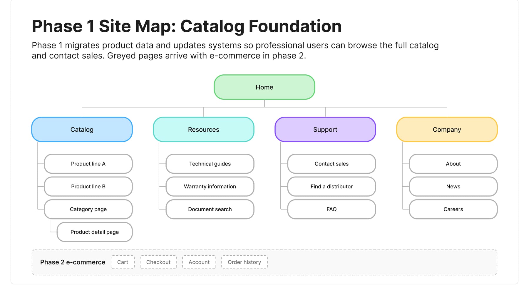
Rather than force one hierarchy, I split the sitemap: one branch for browsing, one for internal organization. It's more structure to maintain, but neither audience has to bend around the other.
3. Decide what deserves priority
Specs, calls to action and imagery competed for the same attention on the old homepage, so none won. Every screen and component then had to justify its visual weight.
4. Replace the hover menu with columns
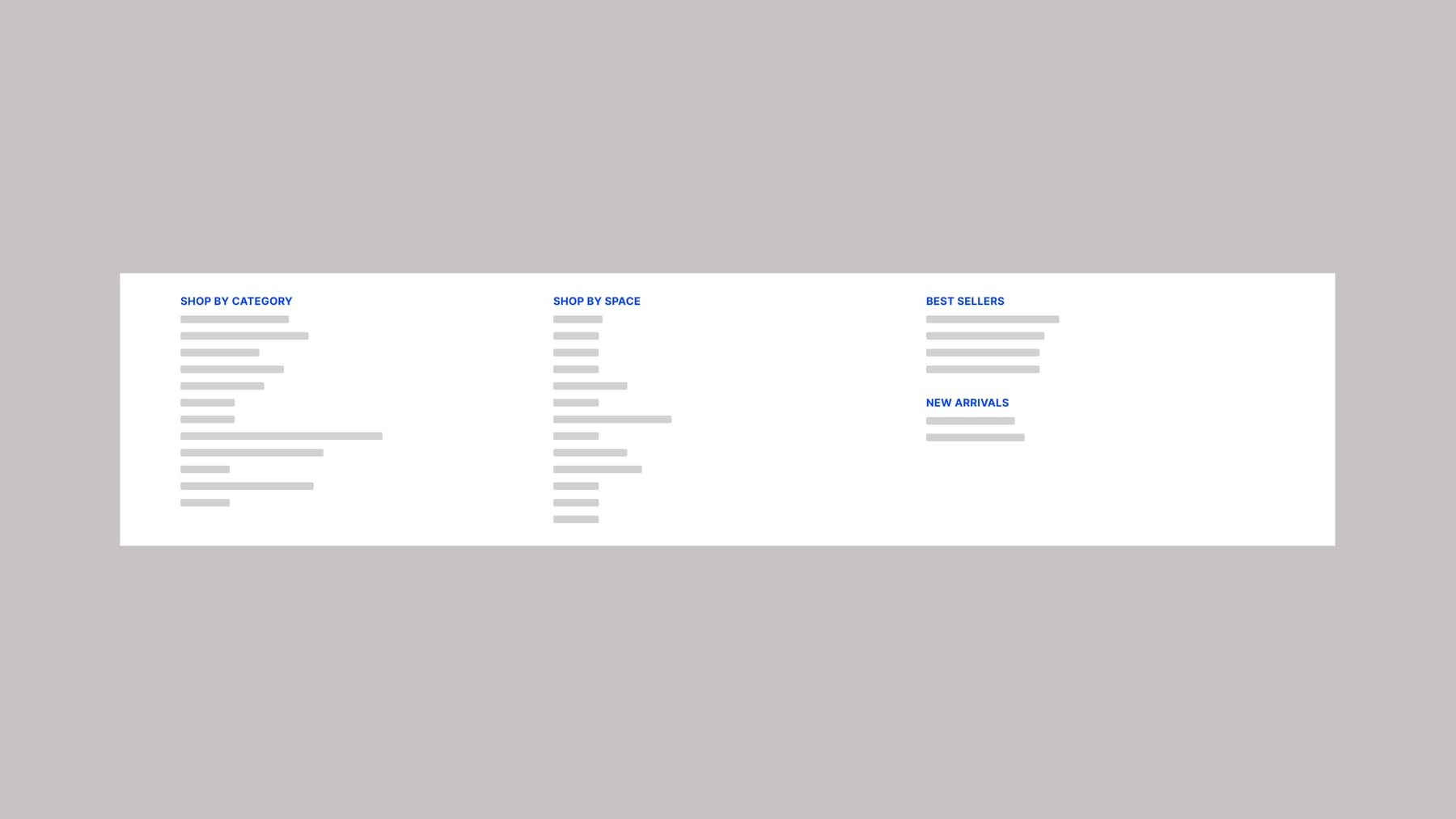
Categories that hid behind a hover now sit in full columns, by category and by space, as soon as the menu opens. Hover states don't exist on touch screens, so I ruled out any pattern that needed one. Best sellers get their own column. The cost is a denser first view.
Before
After
5. Show results while people type
Search used to mean leaving the page, waiting, then finding out whether the query worked. Inline live search filters as you type, so that gap is gone.
6. Rank the specs
The old listing gave every attribute equal weight. I moved a smaller set into the filters and display, and pushed the rest one click deeper, so buyers narrow by what usually matters.
7. Lead with the swatch
The old color picker relied on hover and full text names, and a long name could break the layout on a small screen. It's now swatch-first, with a visible label that holds whether the name is short or long.
Results
The site is live, but not enough time has passed to report before and after numbers. Traffic and contact with the sales team, the site's main call to action, are being tracked.
What I would do next
I'd bring real content into reviews earlier. Placeholder content hid disagreements about order and hierarchy, and those are cheaper to settle early. I'd also give imagery the same rigor this phase gave data and structure.